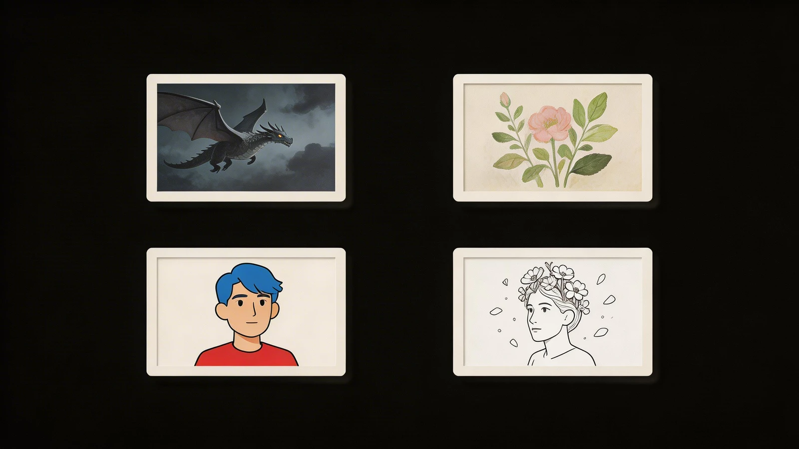
The overwhelming majority of online art portfolios are painfully boring.
When a typical artist launches a website, they default to the exact same organizational logic used by Facebook or Instagram: Chronological Masonry Grids. They create a page called "Gallery," completely dump sixty different paintings into it, and organize them based entirely on the date they were painted.
This is algorithmic thinking, not artistic thinking.
If a prestigious Gallery Curator in New York clicks a link and sees another standard grid of sixty random squares, their brain shuts down. They have seen this exact layout ten thousand times. To secure high-end B2B representation, your digital presentation must prove that you understand "Curation" (the act of actively manipulating how a viewer experiences art). Here are three structural portfolio ideas that aggressively break the digital mold.
Idea 1: The 'Exhibition Room' Layout
Do not build a generic "Gallery." Build digital "Rooms."
Instead of dumping everything into one pile, structure your website's top-level navigation identically to the architectural floor plan of a prestigious physical museum.
The Execution: Give the viewer highly restricted, hyper-focused sub-pages.
- Room A: The Indigo Series (Paintings exploring the color Blue).
- Room B: The Charcoal Anatomy Wall.
- Room C: The Multimedia Sculptures.
By forcing the gallery director to click specific "Rooms," you regain complete psychological control. They enter a space knowing exactly what thematic thesis you are exploring, making the artwork infinitely more impactful than a random chronological scroll.
Idea 2: The 'Process Deconstruction' Landing Page
Most artists desperately hide their mistakes, only showing the final, perfectly polished painting on their homepage.
You can break the mold by celebrating the chaos of B2B production. If an Art Director is looking to commission a massive mural for a public building, they need to know you possess the stamina to actually execute it. The finished artwork does not prove stamina; the raw process proves stamina.
The Execution: Turn your entire homepage into a massive, scrolling "Case Study." Instead of a grid of small thumbnails, utilize a single, massive vertical scroll. Start at the very top of the webpage with a photo of the completely blank canvas sitting in your dirty physical studio. As the Art Director scrolls down, the web page reveals massive, chronological photographs of the painting taking shape: the charcoal under-drawing, the messy acrylic under-painting, the fine-detailed glazing process, and finally, the breathtaking finished piece.
You did not just show them a painting; you forced them to experience a six-month creative journey in sixty seconds.
Idea 3: The 'Macro-Crop' Cinematic Header
Abstract artists frequently struggle to convey their intricate physical brushstrokes on tiny digital laptop screens.
The Execution: Do not show the whole painting immediately. Use a "Macro Header" design. When a collector loads your URL, the entire screen should be filled with an impossibly close, 4K resolution macro-photograph of a single, highly textured smear of thick oil paint from one of your major pieces.
The collector cannot see what the painting is yet. They are simply overwhelmed by the raw, physical geography of your paint application. As they scroll down the page, the website slowly zooms out, eventually revealing the completed masterpiece. You have utilized digital architecture to build narrative suspense natively.
Shattering conventional web design requires a platform built exclusively for visual media. By migrating your fine art to Portfoliobox, ambitious painters instinctively leverage uncropped masonry structures, dedicated sub-gallery rooms, and massive full-bleed hero banners required to execute truly disruptive digital exhibitions — no coding required.