Table of Contents
Global mobile styles allow you to define how your portfolio website appears on mobile devices. These settings apply across your entire portfolio, ensuring a cohesive and responsive design. You can also edit the mobile style of specific elements, such as a single header or paragraph, and when you do, that element-specific style will override the global settings.
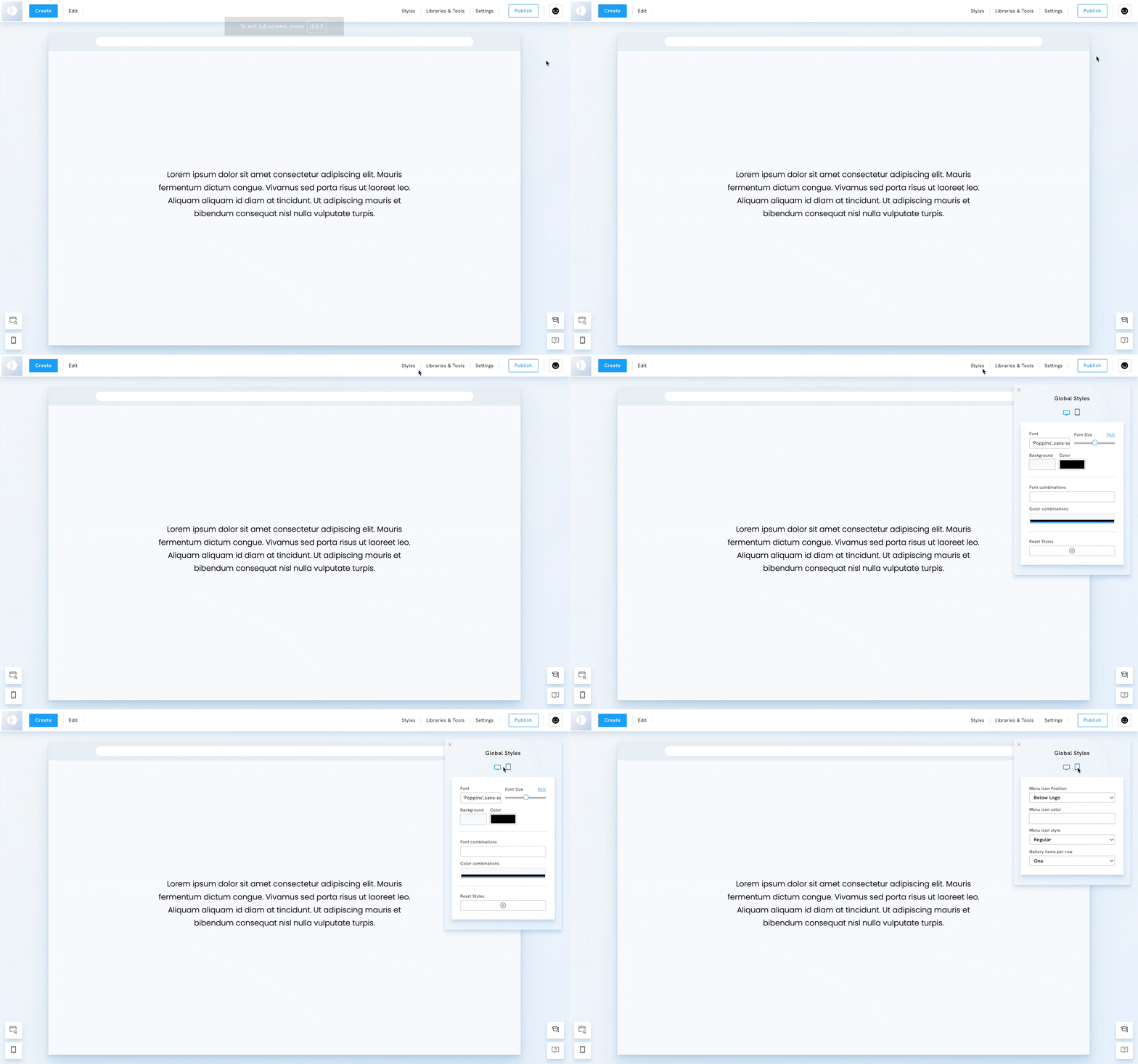
Access the global mobile styles
- Go to Styles
- Click the Mobile Icon

Global mobile styles
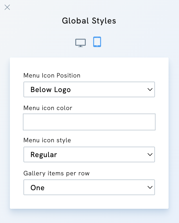
The settings below are available in the global mobile styles:
- Menu Icon Position: choose where the mobile menu icon appears (e.g., below the logo).
- Menu Icon Color: adjust the color of the menu icon
- Menu Icon Style: select different styles for the menu icon
- Gallery items per row: control how gallery images and other list-style content are displayed on mobile. Choose between Default, One, or Two images per row for better responsiveness.
💡 Tip: Preview your portfolio on different devices to confirm that your mobile styling feels consistent, user-friendly, and aligned with your creative brand.


