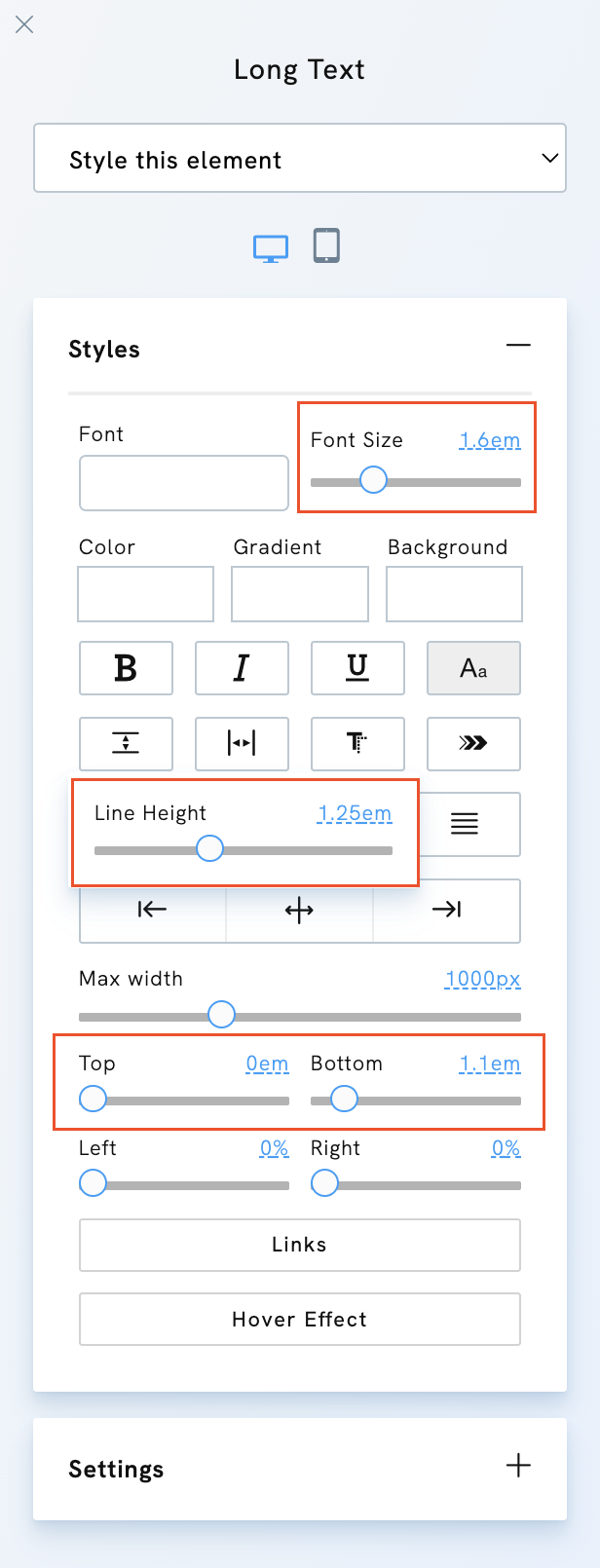
When customising your portfolio website, you may notice that some style options, like font size or spacing, are measured in relative units (such as em, vh, or vw) instead of pixels (px), which are absolute units. These relative units are easy to use and play a big role in making your portfolio responsive across all screen sizes.

The difference between absolute units (px) and relative units (em/vh/vw) is that pixels remain the same regardless of the screen size.
Consider this: 1 pixel on a small mobile screen and 1 pixel on a big 4K screen will occupy the exact same amount of space. However, when you opt for em/vh/vw units, the elements automatically adapt to the screen size. This means that your text, the distance between elements, and more will be relative to the screen size. In other words, your portfolio will adapt to any device, significantly enhancing responsiveness. This practical application of relative units in web design is a game-changer.
Here's a handy tip: if you're finding it tricky to select a precise number using the slider, you can use the arrows on your keyboard. This small trick can make a big difference in your web design process.


