Table of Contents
Choosing fonts and colours might seem like a small detail, but they have a big impact on how your website feels. The right combination can create a mood, guide the viewer’s eye, and make your work look instantly more polished and professional.
That’s why Portfoliobox offers curated font and colour combinations: handpicked pairs that work beautifully together, so you can spend less time deciding and more time creating.

Why use preset font & colour combinations?
1. No design skills needed
You don’t need to be a designer to make something that looks amazing. Our presets are crafted by design experts to ensure your typography and colours are balanced, readable, and visually cohesive. Just pick the one that matches your vibe.
2. Everything works together
Fonts are paired to complement each other, like a strong display font for headlines with a clean, readable body font. Colours are chosen to create harmony across your site, with automatic updates to your button styles and hover effects for a polished touch.
3. It's faster (and less overwhelming)
Starting from scratch can be overwhelming. With presets, you can skip the trial-and-error and go straight to a beautiful result. Choose a look that suits your brand and start building right away.
4. You can still customise
Love a preset but want to tweak the headline font? Go for it. You can use the combinations as a starting point and adjust as you go, just with a little less guesswork.
How to pick the right font & colour combination
Not sure where to start? Consider the mood you want your site to convey, and then select a combination that supports that feeling.
Font combinations
Minimalist & professional
Choose Outfit/Inter, Montserrat, or Poppins for a clean, versatile style that’s easy to read.
Bold & full of personality
Want something playful and high-energy? Try Archivo Black / Hanken Grotesk, Fugaz One / Work Sans, or DM Serif Display / Hanken Grotesk; these fonts are great for artists, musicians, and creatives.
Elegant & editorial
For a timeless, polished look that works beautifully for portfolios or writing, go with Prata / Lora, Garamond / Spline, or EB Garamond.
Structured & modern
Fonts like Space Mono / Bitter, Ubuntu Mono, and Roboto Condensed have a clean, functional feel; perfect for developers, architects, or tech-driven brands.
Warm & approachable
If you're looking for something soft and welcoming, consider Zilla / Hanken Grotesk, Barlow / Open Sans, or Nunito Sans / Nunito; ideal for blogs, wellness sites, or small business websites.
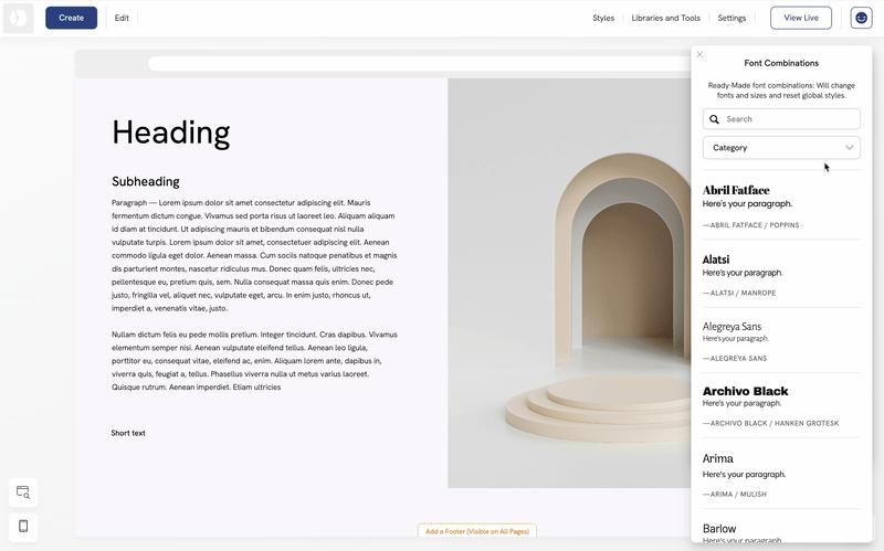
Your fonts do more than display your text; they help tell your story. Use them intentionally, and they’ll do a lot of the heavy lifting for your brand identity.
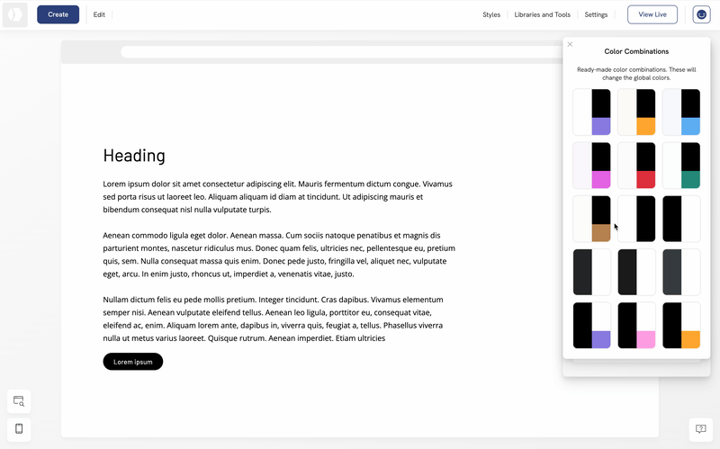
Colour combinations
Your colour palette says just as much as your fonts. Whether you want something soft, vibrant, warm, or minimal, there’s a curated combo to match.
Bright & bold
Perfect for creatives or modern brands that want to stand out. These palettes often feature saturated backgrounds, strong contrasts, and colourful buttons.
Soft & neutral
Choose these if you want something clean and calming. Ideal for photography, design, or personal websites, they let your work take the spotlight.
Warm & earthy
These give your site a grounded, natural look, great for wellness, lifestyle, or sustainability-focused projects.
Minimal & monochrome
Ideal for a timeless look with ample white space. Simple doesn’t mean boring, it means focus.
Bonus: all colour combinations now include smart button styling, with hover effects that gently darken the buttons by 3–4% for a polished, interactive touch.
With the right combo, your fonts and colours can do more than decorate—they can communicate, support your message, and make your work shine. And with Portfoliobox presets, getting there is as easy as picking your vibe and clicking “apply.”
